This was a university assignment issued by my User Interface & User Experience unit at the University of Canberra (UC), Australia. The brief was to design an app that assisted in reducing the attrition and non-completion rate of first year university students at UC by identifying a problem to solve.
In my research I identified that common challenges faced by mature-age first year students (through a series of interviews) were having to re-learn a significant amount of basic academic research and writing techniques they hadn’t used in years. Although in-person and virtual resources were available to assist students, their problem was exacerbated by the challenge of having to navigate through university provided online study resources and support services. The actual utilising of those resources proved to be an ongoing frustrating experience. This was due, in part, to the lack of ‘easy to find’ learning contents in a centralised location.
The design solution that I proposed was to integrate existing university app/s (mobile) and content into a streamlined virtual infrastructure. Essentially, a dedicated hub to assist in filling knowledge gaps and enhance skills that is relevant to the said target market. In this project my proposed design solution was to actually redesign the UC Mobile App interface. My rationale was that existing resources are readily available for students, what I am doing is making sure those content are more easily found and intuitively located on the mobile app interface.
Software used: Adobe XD, Adobe Illustrator and Adobe Photoshop
My hi-fi Prototype link here.
Final Presentation (Screen Recording)
This is the final submitted hi-fi prototype. The recording length is approx. 1 min. Based on the final data collection and data analysis stage of the hi-fi prototype development, the users felt the app:
• Guided them through the process
• Easy to understand (ie. icons and text)
• Is something they would use in real-life
• Does what is says it does
These feedback closely relates back to the keywords that I aimed for users to describe the product to be; functional, self-explanatory and hassle-free.
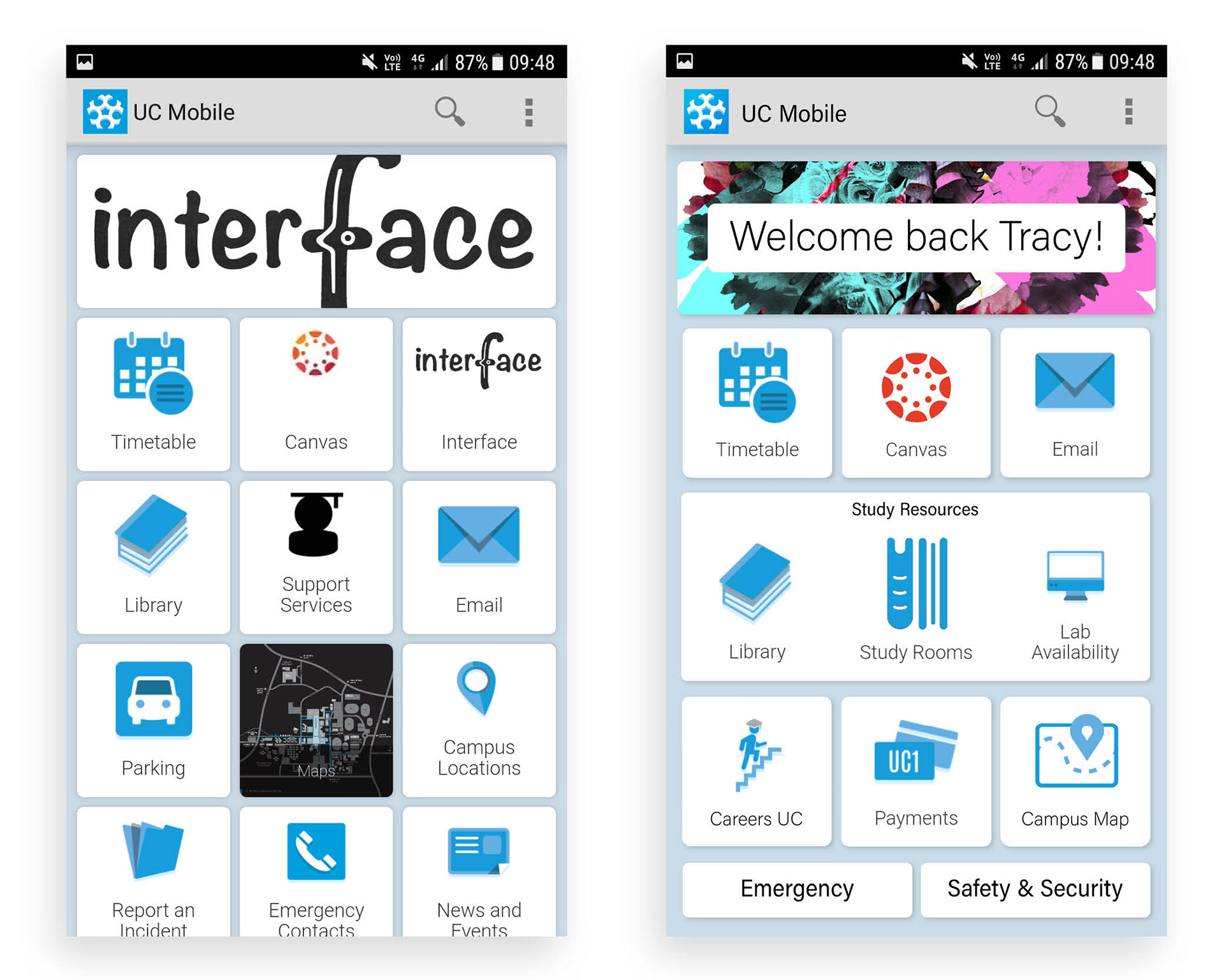
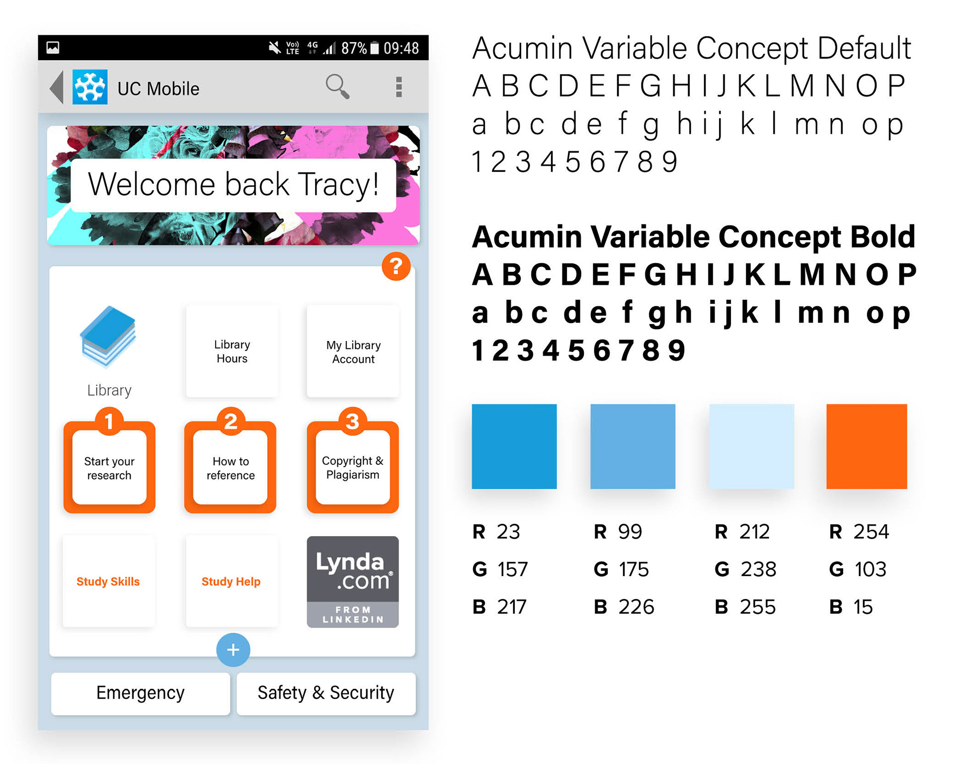
The image below left are the current (old) interface design of UC Mobile App, whilst the images on the right are the app re-design concepts. The redesign feature a centralised arrangement of study related contents, topics and facilities in the focal point of the app's homepage. I also included a customisable banner at the top of the interface to make the app more personalised.
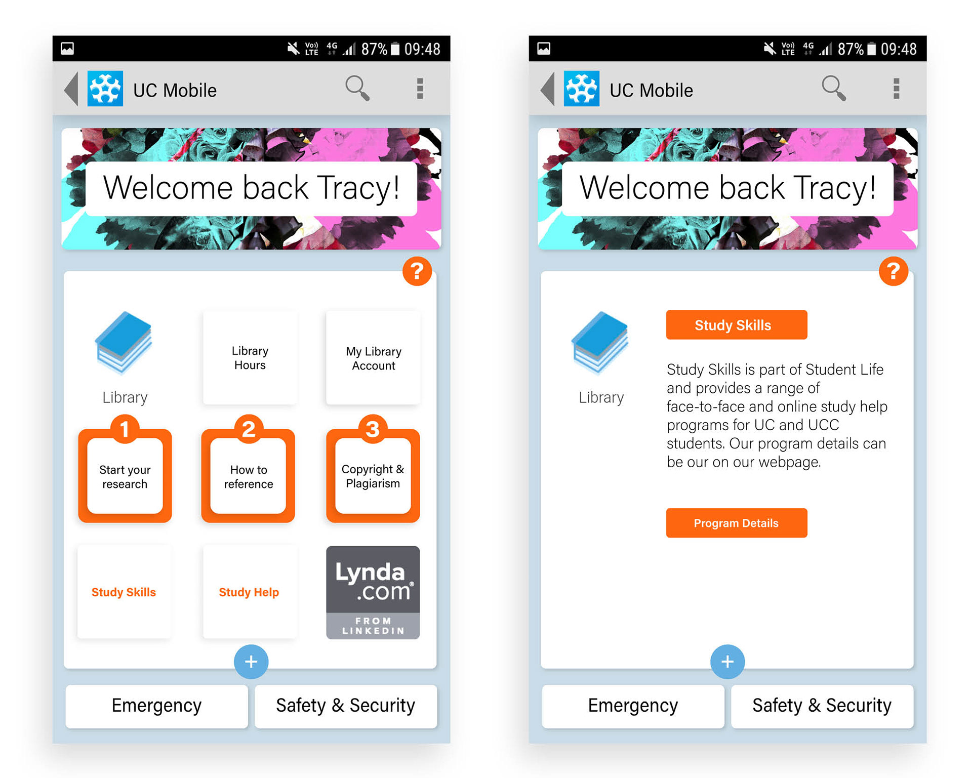
Feature - Study Resources page
The buttons in the middle row, in the below left image, are numbered one-three to show the recommended steps in the process of starting a project. The bottom row consists of additional, more focused, study assistance and support services (ie. Study Skills, Study Help and Lynda) integrated into the app. There are also various webpages that contain a varying amount of information relating to different study contents on the university web pages. Hence, I created a summary page where users are directed to for more information, before moving onto the corresponding site/s (below right image).
Branding, Visual Aesthetics and collateral
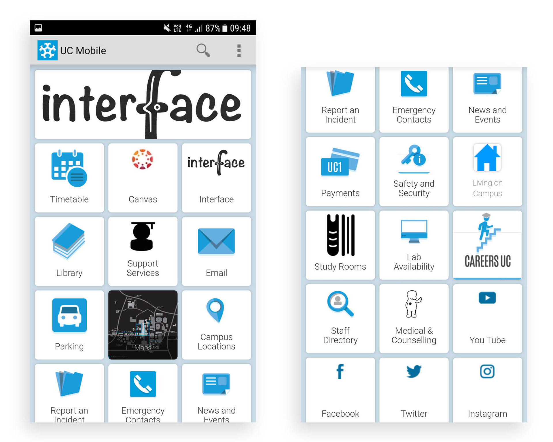
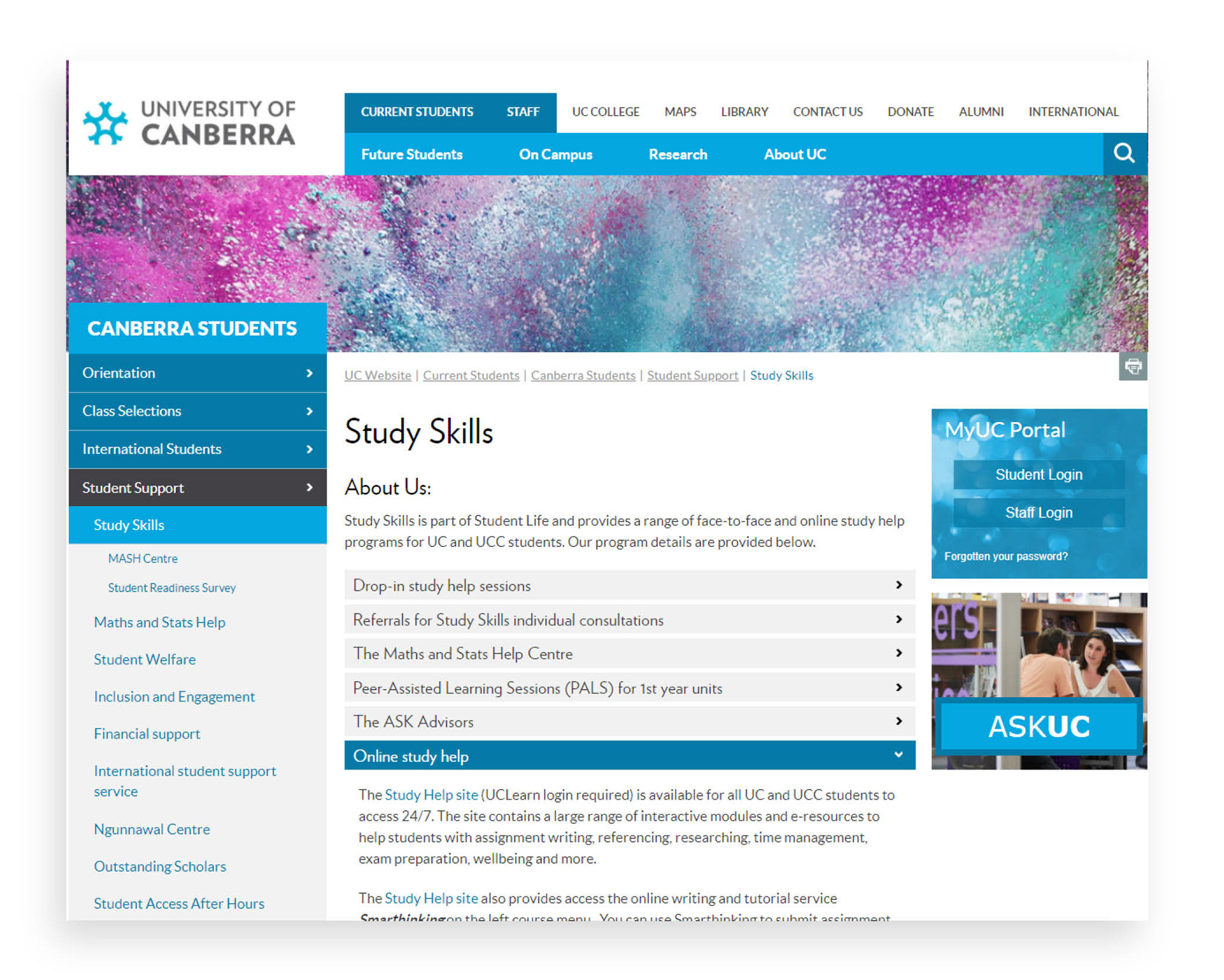
A significant part of my UC Mobile App redesign is to ensure that my hi-fi prototype is aligned to the branding and presentation of the original mobile app. Although, the actual branding guide for UC was not available for this assignment-brief, there were plenty of existing web branded collaterals I could reference. Below are screenshot images of my current student mobile interface of the UC Mobile App and also the UC website.
Additional visual components
© Tracy Ng. All rights reserved.