
Background
TABASCO® brand Pepper Sauce is a hot-sauce produced in the US in the Southern State of Louisiana. The company is founded and family owned since 1868.
One of TABASCO® identifying feature is the green and red diamond logo, along with its sharp spicy and tangy sauces. The pepper sauce's brand and logo has largely stayed true to its original inception.
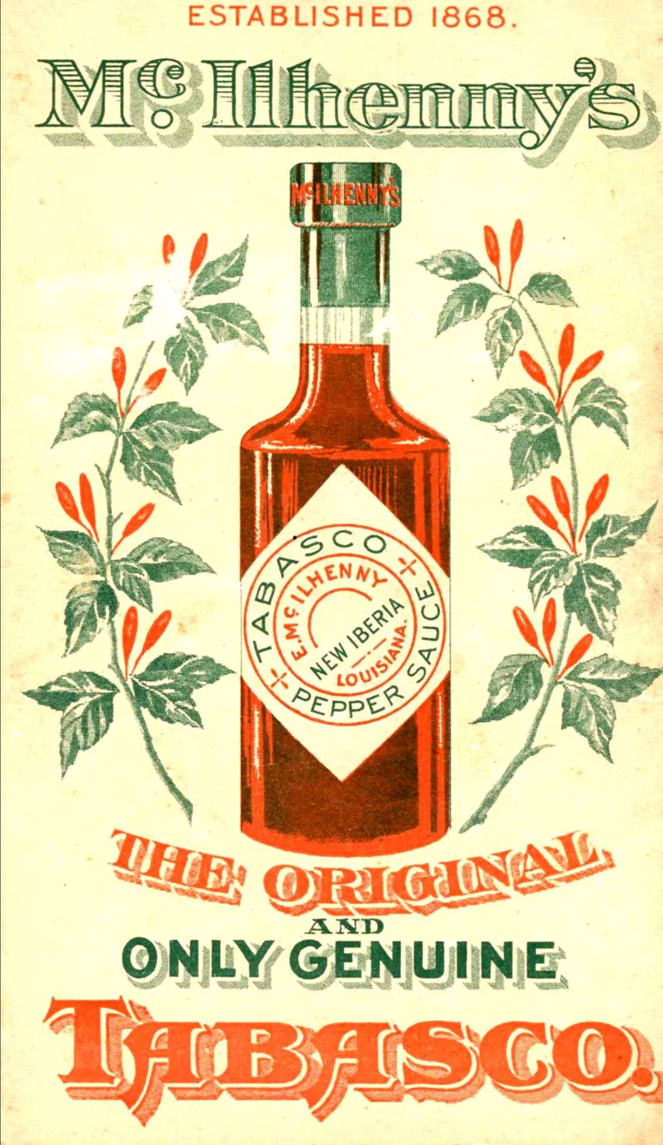
Image source: Britannica, 2024
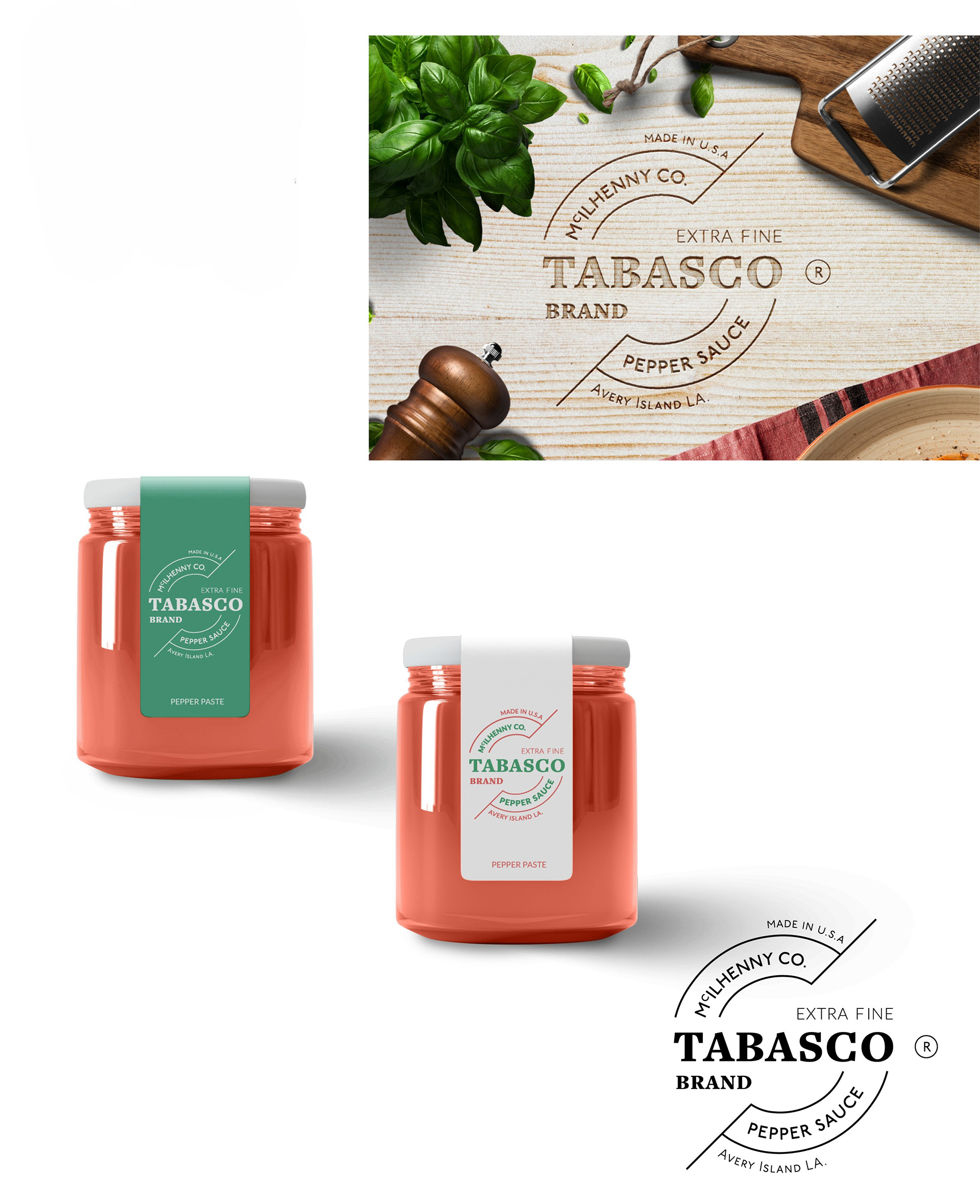
Concept
In this project I wanted to modernise TABASCO® brand Pepper Sauce’s branding and logo, however, due to their strong established identity it was going to be tricky. Instead, I decided to revisit some of TABASCO’s range of food products to see if I could repackage a few for the luxury gift market. This would then allow me to develop a more contemporary identity for this line of food products.
My main focus was to ensure that this range of food products' packaging emphasises the artisinal qualities of the brand, moving away from the classic-rustic design to be more minimal and contemporary.
Thus, the TABASCO Brand EXTRA FINE product range was born featuring three updated food/ condiments concepts. For this project, I created three slightly different logo variations for EXTRA FINE.

-------------------------------------------------
TABASCO Brand: Concept One
EXTRA FINE PEPPER PASTE
In this concept for the Pepper Paste, I based the design on the earlier versions of the TABASCO® logo with the slanted type presentation. I thought to push the design a bit more by removing the diamond border altogether. I paired a hefty display font (rustic feel) with a slight geometric sans serif font (contemporary feel). The circular lines and layout is used to complement the shape of the jar that contains the Pepper Paste too.
-------------------------------------------------
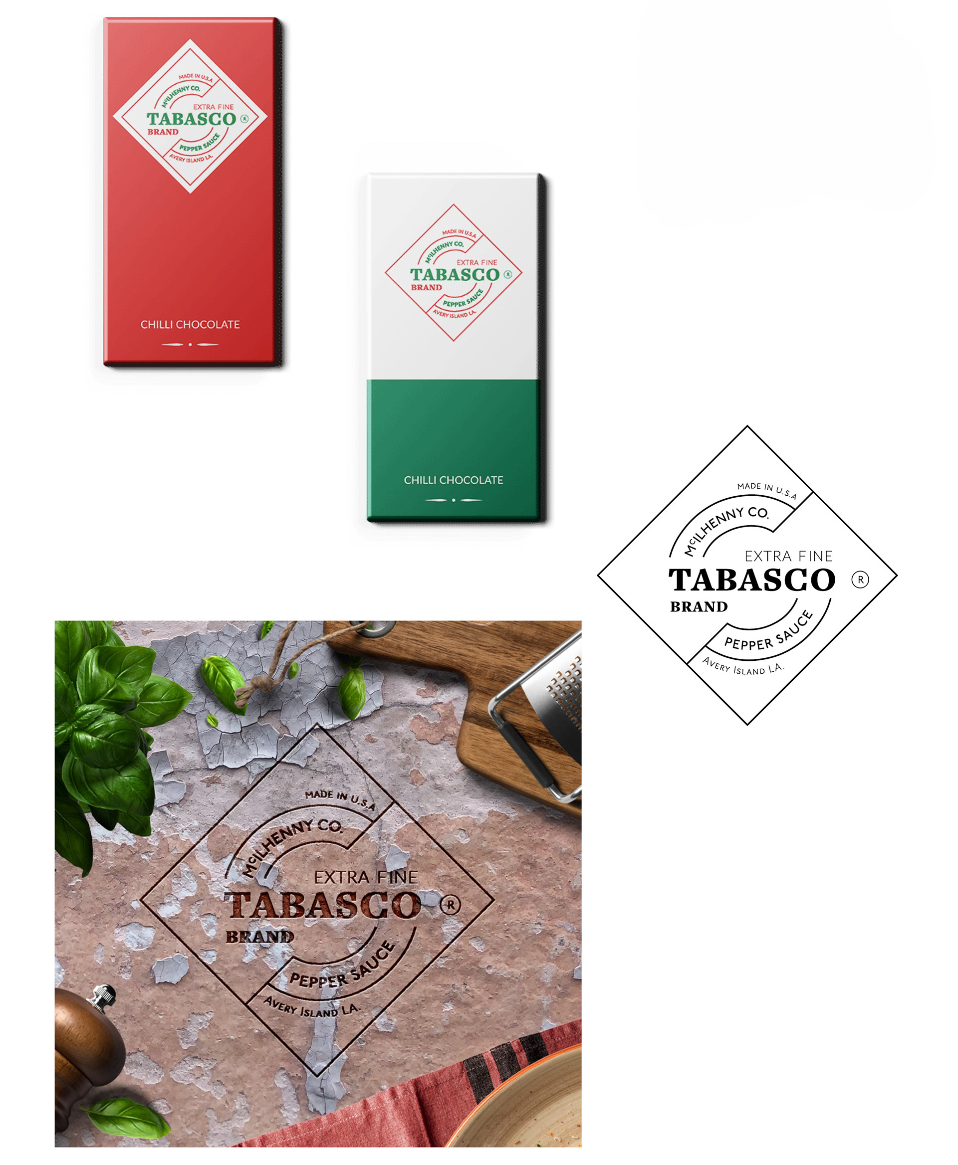
TABASCO Brand: Concept Two
EXTRA FINE CHILLI CHOCOLATE
TABASCO® has a range of their own pepper sauce flavoured confectionary gift products. In this concept, I decided to give the classic TABASCO Chocolates an updated look by opting for sleek, thin and minimal direction. I brought back the diamond border into this design.
-------------------------------------------------
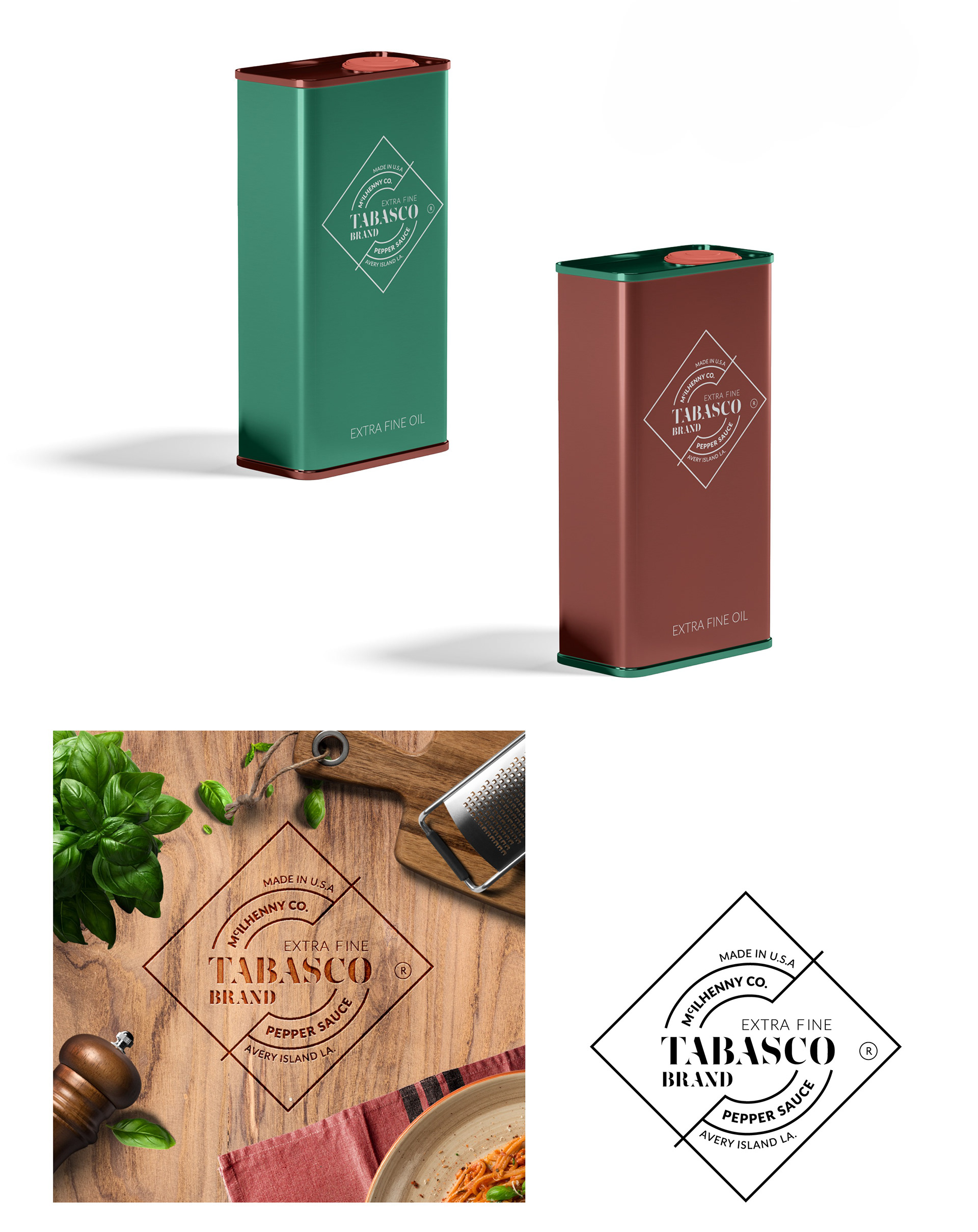
TABASCO Brand: Concept Three
EXTRA FINE (SEASONING) OIL
In this logo variation I wanted to push the design just a little more by adapting a more abstract typeface. The new typeface utilised negative spaces and ended up having a near futuristic-look. This influenced the chilli oil packaging where I opted for a matte oil tin.
-------------------------------------------------
TABASCO and the DIAMOND and BOTTLE LOGOS are trademarks (the "Marks") of McIlhenny Company, Avery Island, Louisiana 70513 USA. McIlhenny Company has granted permission for the use of the Marks, and for the use of the modified TABASCO and DIAMOND LOGOS, on this webpage only. The Marks and the modified TABASCO and DIAMOND Logos shall not be reproduced without permission from McIlhenny Company.
-------------------------------------------------